Thursday 23 May 2024

Reflection Point : What Have I Learned About Independent Music Magazine Websites?

What I have learned from looking at three different independent magazines websites is that the level of quality can vary, this is due in part to the need to have a great amount of resources in order to have a top tier website. And to be a successful website needs to reinforce the brand identity, such as having the same masthead they use for their magazine as well as prominently displaying the most recent issue they have published; want you to buy it. The goal is for the website to feel like the person visiting the website is reading the magazine, by using the same colour scheme or speaking about similar subjects. The reason for this is that they wish long time readers to recognise the website as the magazine as it will make them more likely if a fan of the magazine to navigate the site for longer. 

Two features of all three independent magazines that I looked at were the promotion of social media platforms that the magazines have a presents on, a second way of boosting engagement as it will incentives further digestion of more of the brands content. A second, somewhat more important feature is the inclusion of advertisements. As these are what keep focusing on the site profitable, along with extra funds which can help go to the independent magazines other ventures, necessary as almost all independent magazines will not have piles and piles of cash to play with so need to use every avenue to be able to keep the business going. The use of advertisements on the website one such way. 
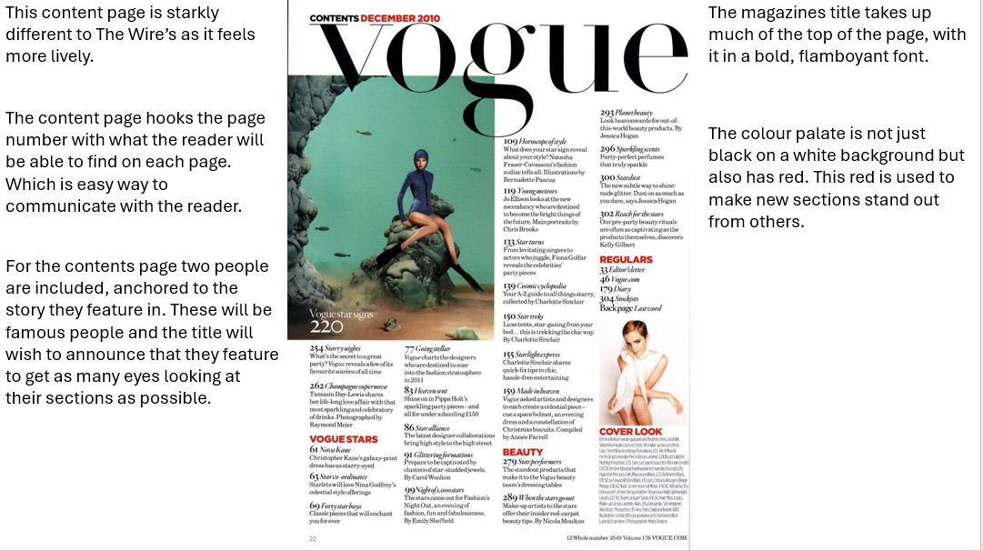
Tuesday 14 May 2024

Research Task Seven : Independent Music Magazine Websites.


One way in which the use of The Wire's website helps to expand the brands identity is that is means being able to explore ideas in full, where on the page of a magazine there is a limit to how long an article can go on for due to page numbers, on their website there is no such limit. And it also makes the website have a functional use, being a place where fans can go for more in-depth analysis. Along with that The Wire's website can use video and audio whilst the magazine cannot. Another way it can expand its brand identity with it able to host radio shows, and use clips. 

To promote the latest issue of The Wire, in the top right corner for almost every hyperlink a person presses on, they will see this issue, and when a newer issue comes out that image will change, but beneath every time is the offer to buy a copy, this is a simple but efficient way to advertise the magazine. 


Friday 10 May 2024

Reflection Point : What Have I Learnt About Magazine Contents Pages?

What I have learned from looking at multiple contents pages is that there are several methods used by magazines to make their contents pages engaging for an audience. 

One such case is the use of images next to stories, for example announcing that they sat down and talked with a well-known celebrity will put a picture of that celebrity next to the story to give it meaning and a picture will draw a readers eye more than just having their name in the description of whatever page their interview is spoken about. 

A second way to make an engaging contents page is with the use of colour. Specifically, having text for headings of new sections be a different colour, this puts emphasis on new sections as it is communicating to readers where one section starts and ends, and where the next begins. For The Wire it was 'Features' and 'Reviews' whilst for Mojo it was 'Features' and 'Cover story' but also something clever that Mojo does is put the page numbers in red whilst its description is in black, to make it nearly impossible not to know where in the magazine this can be found. 

Thirdly the cover lines are, though stylized, kept simple. There never done in a way where it could be a struggle for some readers to understand them. Though The Wire, Mojo and Vogue interpret a contents page differently, they all understand that it should not be a mess of words on a page. All keeping some structure, going down in a listed order of each story and what it features. As to not confuse an audience. 

All three of these details are important to the creation of content pages, as for a magazine a contents page can make the difference between a person choosing to read the magazine and not. And a contents page will be highly likely the second page they see of the magazine, apart from the front cover, skimming it to see what the content is, and where in the magazine they can find it. But if they find the contents page too confusing or unappealing, they may just put the magazine down. That is why the colours used should be chosen to make the contents page pop and definitely use pictures to get across the stories the magazine wants the average readers eye to go to. 

Research Task Six : Wider Research Into Magazine Contents Pages.


Tuesday 7 May 2024

Research Task Five : The Wire Music Magazine Contents Pages.


Reflection Point : What Have I Learned About Independent Music Magazine Front Covers?

From my research into independent magazines front covers, the two independent magazines I used as  examples being The Wire and RnR. 

One similarity between the two is that they have gone through re-brands (in the case of RnR two re-brands) it can be assumed that these changes to the titles were done by the creators under the belief that it would make their titles more eye-catching or wanting to have a more recognizing name for readers. For The Wire they had previously been published monthly as Wire but later became The Wire to be more notable. For RnR's re-brands, they had originally been called 'RocknReels' in 2007 when a matter of years later the title was called R2, until halfway through 2017, when the title became what it has been known as today, RnR. Independent magazine titles are important as they need to be noteworthy enough for peoples eyes to be drawn to them especially since it is rare for independent magazines to survive in such a competitive industry, and the fact that the two of these titles have survived whilst being independently owned could in some small way be helped by these titles both knowing when they needed to conduct a re-brand in order to entice a higher level of readership. 

Both of these magazines almost always use their main image of an artist on the front cover, especially in the case of The Wire, they feature artists in particular who are underground or lesser known. This appeals to the target audience as it helps to get across what the titles topic is, it also helps to promote the smaller artists, which The Wire specifically sites as its mission. 

RnR blends its main image as the cover whilst The Wire focus on a different colour palette for each, both differentiating and also intended to be appealing to audiences. 

Both consistently without fail, have their titles in the skyline. They did so to make clear to their readers what they should expect from an issue of The Wire or RnR. 

Planning Task One : Magazine Title and Strapline.

To decide what the strapline and title should be, they need to relate to the music magazine which will center mainly on the pop genre.  The ...