Magazine 1:
Magazine 2:
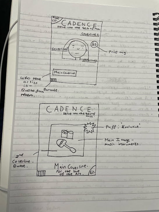
These are two mock-up drawings of how I would like to lay out the two issues of Cadence. As though it were the real two first issues of a new music magazine.
Alongside the layout, these are some examples of the coverlines which may end up as the real coverlines for each magazine. To be authentic have included details like: a barcode, price tag and puff. Items which will be required on the final product.
There may be areas I later wish to change for instance why the coverlines are not definitively going to be in the final product as they are. But this will be in someway how I envision currently the final product coming out looking.
Even from the very first concept to the individual ones - there is changes, so more are most likely to take place.
And also, as set out in Task 3 - I plan on using a different font for the masthead and strapline. Watermelon font & Retro Cool font. Which will make these covers look even different to their final form. But these mock ups are important as it will give some structure and be able to look to them for a consistent vision. And I already made clear, I plan on having the title at the top of the cover in large and then just beneath far smaller, the strapline as an accompaniment.


