Monday 30 September 2024

Planning Task 7: Website Homepage and Linked Page.


This image should loosely look like the homepage of my music magazines website for when users go into the website. I plan on having the masthead remain the same as the font used for the masthead of the two magazines. I am also debating whether or not to include the magazine strapline to further connect into the minds of website visitors between the website and both printed editions of the magazine (something that several music magazines and magazine websites offer). The difference between a website and magazine of course is the interactivity aspect of a website - which is what will be crucial on fulfilling on. 
One other method to connect the two products: website and magazine will be including ways to purchase the magazine on the website. Needing to be simple for the ease of use by visitors, but not too basic as to come across as not professional enough. In essence, the theme for the website should be minimalist. 
And will need to harness the main positive that websites have over print media such as: magazines, their interactivity. 

Like any website from a business will want to include the businesses mission statement as a music magazine. Similar to The Guardian which sets out on its website that it is a not for profit print media distributor. This detail will help to make the website feel more legitimate and by setting out its doctrine would make it different to its competitors in the highly unsafe world of magazines and especially music magazines. Setting out these missions in the 'about' section of the website. 

If interactivity is to be the key in defining the website, then will want to include details such as the subscribe feature and hyperlinks to the brands social media elsewhere to keep the audience connected to the brand. Moving beyond just a monthly read that once done with, forget about till the next monthly release. 


Tuesday 17 September 2024

Planning Task 6: Contents Page.

Like any magazine a contents page will be helpful for the readers to navigate the contents of the magazine, since most readers do not read a magazine in the traditional sense as a book, since there will be parts they specifically want to read, compared to other parts. 
That is why the contents page is of such importance, for its usefulness it must be easy to use otherwise people may simply choose not to read. 


These are in essence how I envision my contents pages looking in the final product: simple and easy to navigate. 
With the main images supposed to be relevant to what is displayed on the contents pages. The mock-ups are similar as I do not believe there is any need to confuse the audience with two drastically different looking contents pages. Since their main focus will be on being functional above all else for the contents page of the magazine, this is why a basic enough format is required. 
Yet, the images will be a good tool to keep an audience engaged, as it will need to be eye-catching. 

Thursday 12 September 2024

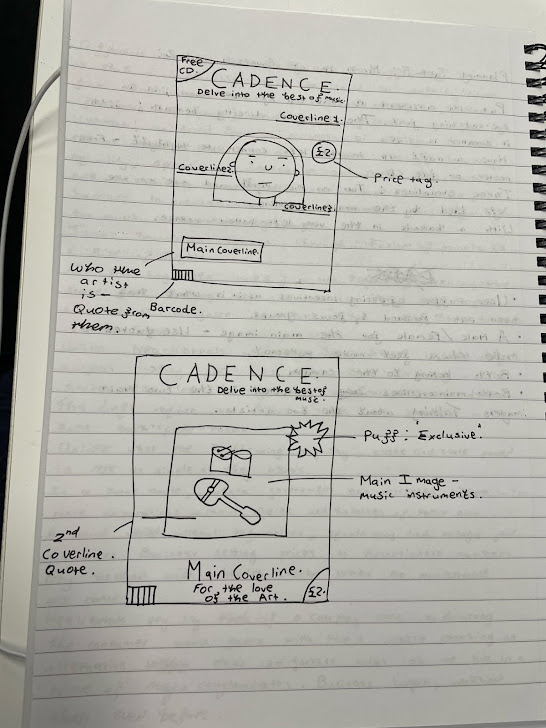
Planning Task 5 : Mock Up Of Covers 1 and 2.

This is the very first, small drawing of how I want the two magazines to look and seen by Magazine 1 and 2 below, clearly do keep quite close to the original concepts. 


Magazine 1: 

Magazine 2: 

These are two mock-up drawings of how I would like to lay out the two issues of Cadence. As though it were the real two first issues of a new music magazine. 
Alongside the layout, these are some examples of the coverlines which may end up as the real coverlines for each magazine. To be authentic have included details like: a barcode, price tag and puff. Items which will be required on the final product. 
There may be areas I later wish to change for instance why the coverlines are not definitively going to be in the final product as they are. But this will be in someway how I envision currently the final product coming out looking. 
Even from the very first concept to the individual ones - there is changes, so more are most likely to take place. 
And also, as set out in Task 3 - I plan on using a different font for the masthead and strapline. Watermelon font & Retro Cool font. Which will make these covers look even different to their final form. But these mock ups are important as it will give some structure and be able to look to them for a consistent vision. 


Tuesday 3 September 2024

Planning Task 4 : Front Cover Design.

There are four main components of all magazines: 
1. Main coverline.
2. Other coverlines. 
3. Main images. 
4. Page furniture. 

Of course, not all magazines will stick to all of these components but they will be the main components magazines choose to include. 
But these will be components used in this music magazines front cover design. 
The fonts for the coverlines will be with the use of the same font as the strapline rather than the font used for the masthead. 
The main image will need to connect to Cadence being a music magazine and also be associated with the pop genre, which Cadence is aimed to focus on. 


Magazine 1. 

Masthead: Cadence. 
Strapline: Delve into the best of music. 

Main coverline: The new album everyone needs to hear. 
Coverline 1: 'A one-hit wonder' proving us all wrong. 
Coverline 2: Results of our audiences favourite artists. 
Coverline 3: Two exclusive posters inside. 


Magazine 2. 

Masthead: Cadence. 
Strapline: Delve into the best of music. 

Main coverline: What the future of music looks like. 
Coverline 1: Poll: Our audiences favourite genres? 
Coverline 2: The stunning story of success. 
Coverline 3: Claim a Free CD. 

Planning Task 8: Photography Planning.

For the two main images, for both magazines I intend on using one male model and one female model, with each image being connected to the ma...